Time series stacked bar plot of the categorical data
A time series stacked bar plot of the categorical data. Count of categorical y_value values of categories in the SQLite table defined by table_name is used to plot this graph.
SQLite table must have; Sample, Date, y_value columns to generate the plot.
If Run column is present instead of Sample column in the table, Run column is used to generate plots.
Example Plot
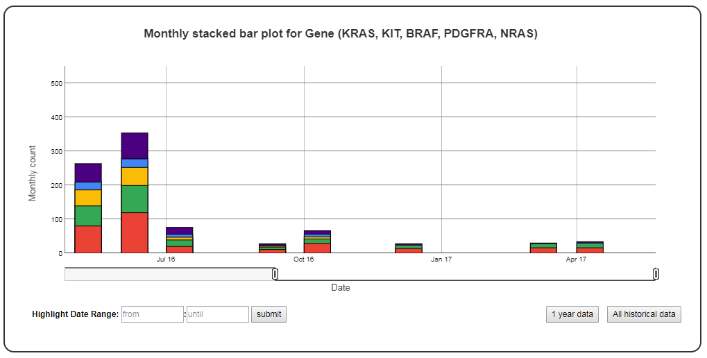
Chart Properties
| Option | Type | Use |
|---|---|---|
| Chart_title | String (Optional) | This is used to create the title of the chart. Default is “Monthly stacked bar plot for {y_label} ({categories})”. E.g. “Monthly stacked bar plot for Gene (KRAS, KIT, BRAF, PDGFRA, NRAS)”. |
| y_value | String (Required) | Column header in SQLite table. The column should contain categorical data. Count of categories defined by “categories” option is plotted on the y-axis. E.g. “Gene”. |
| y_label | String (Optional) | This is used to create the y-axis label in the chart. Default is “Monthly count”. |
| categories | String (Required) | This is used to select subset of categories from the SQLite table’s y_value column. Maximum 10 categories can be specified in a single graph. To track more than 10 categories create multiple graphs. E.g. “KRAS, KIT, BRAF, PDGFRA, NRAS”. |
Example JSON entry (minimum):
[
 {
  "chart_type": "time_series_with_stacked_bar_plot",
  "chart_properties": {
      "y_value": "Gene",
      "categories": "KRAS, KIT, BRAF, PDGFRA, NRAS"
      }
 }
]
Example JSON entry (full) to plot all samples excluding NTC
[
 {
  "table_name": "VCS_Stats_Summary",
  "include_samples": "all",
  "exclude_samples": "NTC",
  "chart_type": "time_series_with_stacked_bar_plot",
  "chart_properties": {
       "chart_title": "Monthly bar and line plot for Gene (KRAS, KIT, BRAF, PDGFRA, NRAS)",
       "y_value": "Gene",
       "categories": "KRAS, KIT, BRAF, PDGFRA, NRAS",
       "y_label": "Monthly count"
       }
 }
]