Time series plot with percentage of samples above threshold
A time series plot representing percentage of numerical data in y_value column of the SQLite table defined by table_name above the user defined threshold.
SQLite table must have; Run, Sample, Date, y_value columns to generate the plot.
Example Plot
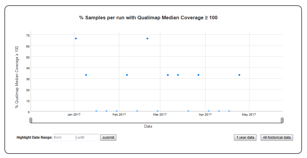
Chart Properties
| Option | Type | Use |
|---|---|---|
| Chart_title | String (Optional) | This is used to create the title of the chart. Default is “% Samples per run with {y_label} ≥ {threshold}”. E.g. “% Samples per run with Qualimap Median Coverage ≥ 100”. |
| y_value | String (Required) | Column header in SQLite table. The column should contain numeric data. This data is plotted on the y-axis. E.g. “Depth”. |
| y_label | String (Optional) | This is used to create the y-axis label in the chart. Default is “% Samples per run with {y_value} ≥ {threshold}”. E.g. “Qualimap Median Coverage ≥ 100”. |
| threshold | Integer (Required) | This is used to compute % of values above the threshold. E.g. 100. |
Example JSON entry (minimum):
[
 {
  "chart_type": "time_series_with_percentage_of_samples_above_threshold",
  "chart_properties": {
       "y_value": "QualiMap_median_coverage",
       "threshold": 100
       }
 }
]
Example JSON entry to plot all samples exluding HCT15 and NTC (full):
[
 {
  "table_name": "Production_Run_Stats_Summary",
  "include_samples": "all",
  "exclude_samples": "HCT15, NTC",
  "chart_type": "time_series_with_percentage_of_samples_above_threshold",
  "chart_properties": {
       "chart_title": "% Samples per run with Qualimap Median Coverage ≥ 100",
       "y_value": "Depth",
       "threshold": 100,
       "y_label": "Qualimap Median Coverage ≥ 100"
       }
 }
]