Time series plot with absolute threshold
A time series plot of numerical data with user defined lower and upper thresholds. Numerical data in y_value column of the SQLite table defined by table_name is used to plot this graph.
SQLite table must have; Run, Sample, Date, y_value columns to generate the plot.
In case of per_sample graph Run column is not required.
For per_sample graph if only Run column is present in the table, Run column is used to generate plots.
Example Plot
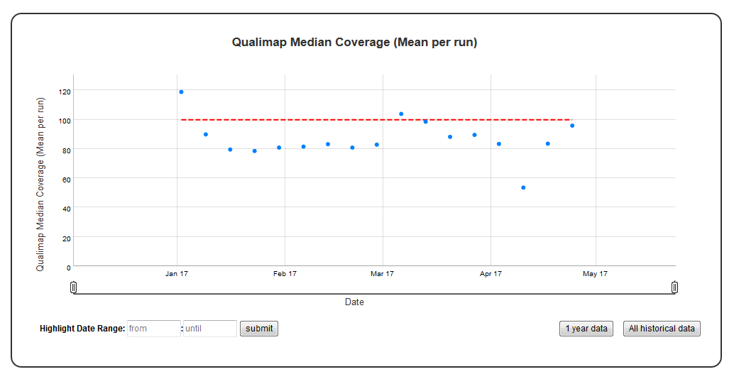
Chart Properties
| Option | Type | Use |
|---|---|---|
| Chart_title | String (Optional) | This is used to create the title of the chart. Default is “{y_label} (Mean per run)”. E.g. “Qualimap Median Coverage (Mean per run)”. |
| y_value | String (Required) | Column header in SQLite table. The column should contain numeric data. This data is plotted on the y-axis. E.g. “Depth”. |
| y_label | String (Optional) | This is used to create the y-axis label in the chart. Default is “{y_value} (Mean per run)”. E.g. “Qualimap Median Coverage (Mean per run)”. |
| lower_threshold | Integer (Optional) | This is used to create lower threshold line on the chart. E.g. 100. |
| upper_threshold | Integer (Optional) | This is used to create upper threshold line on the chart. E.g. 300. |
| per_sample | Boolean (Optional) | Plot per sample graph. Default is “False”. If set to “True” per sample graph will be plotted. |
Example JSON entry (minimum):
[
 {
  "chart_type": "time_series_with_absolute_threshold",
  "chart_properties": {
      "y_value": "Depth",
      "lower_threshold": 100,
      }
 }
]
Example JSON entry (full) to plot all samples excluding HCT15 and NTC:
[
 {
  "table_name": "Production_Run_Stats_Summary",
  "include_samples": "all",
  "exclude_samples": "HCT15, NTC",
  "chart_type": "time_series_with_absolute_threshold",
  "chart_properties": {
      "chart_title": "Qualimap Median Coverage (Mean per run)",
      "y_value": "Depth",
      "lower_threshold": 100,
      "y_label": "Qualimap Median Coverage (Mean per run)",
      "per_sample": "True"
      }
 }
]